MobilityAnalyst Dashboard
Results
Set measures
Active travel policy
- up to
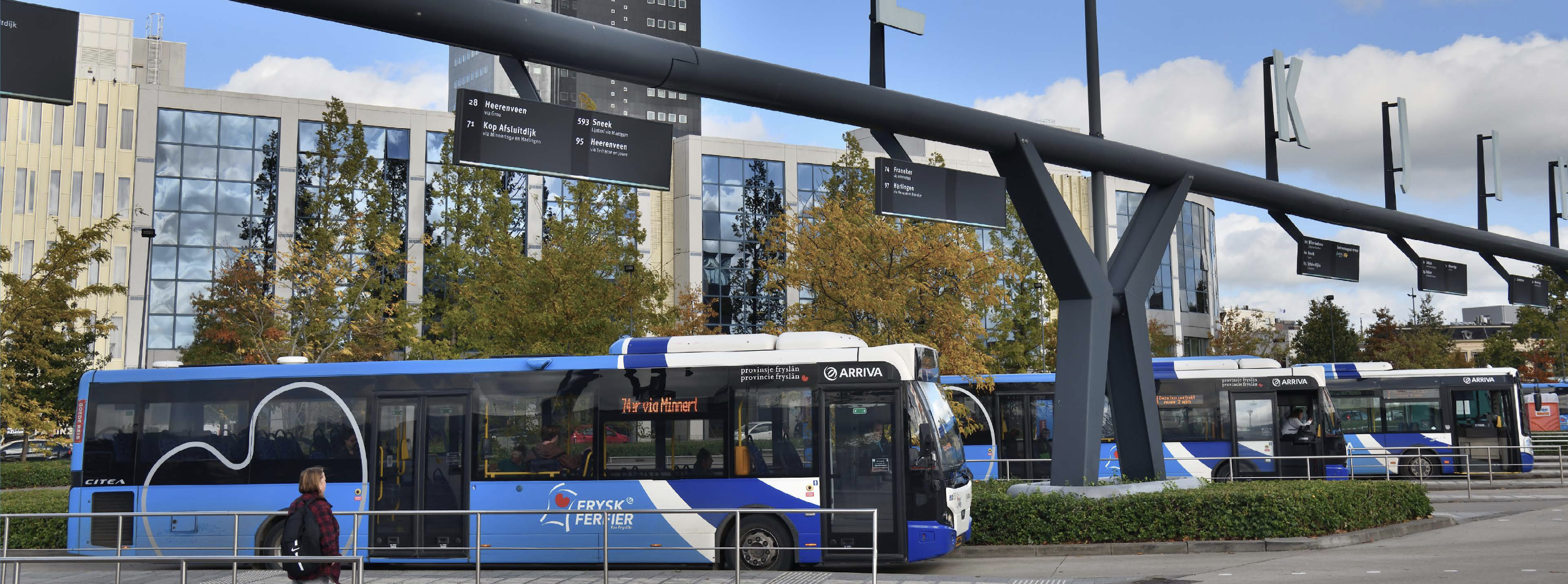
Public transport policy
- the additional travel time compared to car is less than
- or the journey is shorter than
- maximum number of transfers:
- first mile:
- last mile:
Car policy
- discontinue company cars
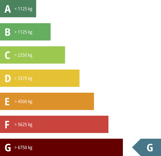
- company car emissions:
- private car emissions:
Time and place
- number of additional remote work days:
- minimum number of days present:
- minimum travel time: minutes
Travel method
| mode of transport | number |
|---|---|
| active travel | |
| Public transport | |
| private car | |
| company car |
Organisation
corresponds to
Planet
People
corresponds to
remote working per week
Modal-split
Current mode of transport
Potential mode of transport
Modality numbers
Walking
→
City bike
→
eBike
→
Speed pedelec
→
Moped/scooter, petrol
→
Moped/scooter, electric
→
Without bicycle use
→
Bicycle in first mile
→
Bicycle in first and last mile
→
Car (P+R) in first mile
→
Private car
→
Company car
→
Mode of transport
Individual travel method options and details
Travel method distribution
Limit values:
Changes in travel method
of the people could commute by other means
Car
()
Public transport
Car
()
Active travel
Public transport
()
Active travel
CO₂ emissions
CO₂ emissions
CO₂ emissions per mode of transport
CO₂ emissions per measure
| Potential savings ofPotential increase of from | |
|---|---|
| Active travel policy | % |
| Public transport policy | % |
| Car policy | % |
| Homeworking policy | % |
CO₂ emissions per FTE
Costs of CO₂ emissions
| Based on residual CO₂ emissions |
|---|
Energy consumption
a reduction ofan increase of
Reports
Breakdown current CO₂ emissions
| Mode of transport | Distance driven | CO₂ kg/km | CO₂ emissions |
|---|
Breakdown potential CO₂ emissions
| Mode of transport | Distance driven | CO₂ kg/km | CO₂ emissions |
|---|
Statutory CO₂ reporting
Choose one of the reports below:
Costs
Variable commuting costs
Variable commuting costs per FTE
Annual variable commuting costs per mode of transport
Cost savings parking spaces
is saved annually
€
Cost savings sick leave
is saved annually
€
Cost savings workplaces
is saved annually
€
Parking
Required parking spaces
current situation
Spaces
Change:
potential situation
Spaces
Required bicycle parking spaces
Required number of charging points
for electric cars
Workplaces
Average location occupancy

current situation
people
Change:
potential situation
people
Average attendance

current situation
days
Change:
potential situation
days
Coworking alternatives
of the remote workers have a coworking office nearby
| Operator | Number of people |
|---|
Time
Total commuting time
Average commuting time
Change in travel time
Overview of individual one-way travel times
Distance
Total distance
Average one-way distance
Vitality
Impact on sick leave due to active travel
per year
Total calories used
Calories burned per mode of transport
Percentage of people who meet the physical activity guidelines
by commuting only
Active travel
Composition of active travel
Time spent on active travel
Overlapping travel options
are also part of public transport policy
Public transport
Composition of public transport chains
Public transport quality
average per public transport trip
Public transport journeys during rush hour
Disembarkation stations
of the public transport commuters
| Last station | Number of people |
|---|
P+R potential
of the public transport commuters can use P+R
| Location | Number of people |
|---|
Car / motorcycle
Fuel mix car/motorcycle
Fleet
Car reduction potential
saved per day