MobilityAnalyst Dashboard
Set your measures
Active travel policy
Set an acceptable distance for active travel and find out for how many people walking or cycling is an acceptable alternative. The input is calculated in kilometres per one-way journey with a dedicated bicycle route planner. For distances up to 1.5 km we assume walking. For distances from 1.5 km to 5 km, we assume a regular (city) bicycle, for distances from 5 to 15 km an e-bike and above that a speed pedelec.
At 'Behavioural simulation', you can specify what proportion of the total potential is expected to switch to active travel. For example: at a value of 100%, the maximum cycling potential is shown, and at 50% the system assumes that half of the potential cyclists will actually cycle. Individual allocation is based on decreasing probabilities.
Public transport policy
Here, you can make decisions regarding the organisation's planned public transport policy.
To assess whether public transport is an acceptable alternative to the car, the door-to-door commute times by public transport and the car are compared, based on current timetables, and including congestion, transfer time and parking time. This can be done in two ways: absolute (in additional minutes) or relative (in percentages). In addition, an lower limit can be set below which public transport is always considered an acceptable alternative.
Different forms of first and last mile transport can be selected: do people walk to the bus stop or station, or do they use a bicycle if it is faster? If cycling is selected, we assume that the person has a bicycle at their disposal. Whether it is actually used depends on the relevant cycling, walking and parking times. Optionally, we can also show the effect of Park+Ride facilities. This involves travelling by car to a P+R site and continuing by public transport. This alternative is only used if there is a suitable P+R site that reduces the total travel time and stays below the set limit.
At 'Behavioural simulation' you can specify what proportion of the total potential is expected to switch to public transport. For example, a value of 100% shows the maximum public transport potential, and at 50% the system assumes that half of the potential public transport users will actually switch to public transport. Individual allocation is based on decreasing probabilities.
Car policy
With these settings you can indicate whether or not company cars change according to the set policy. Normally, MobilityAnalyst does not change company cars. However, if you do want to replace company cars by bicycles or public transport within the set measures, then tick the corresponding checkbox.
You can also set proposed CO₂ reductions for company cars and private cars. If no company cars are specified, the associated measures will not be shown.
Examples of possible CO₂ saving measures are:
- Fuel-efficient driving courses and monitoring (often good for 3-8% CO₂ reduction)
- The correct tyre pressure (often good for 2-5% CO₂ reduction)
- Making your vehicle fleet more sustainable by (accelerating) replacing cars with electric cars
Time and place
- minutes
Remote work policies can have a major impact on all your mobility figures, such as costs and CO₂ emissions, but also on parking and workspace facilities.
This measure allows you to specify the number of (additional) days one does not travel to the location per week (in addition to the values that may have been specified in the input template) and to specify a lower limit for the number of days that the person must be present. This measure can be applied to long-distance travellers only (e.g. by filling in 30 or 60 minutes as a lower limit) or to all persons (please enter '0' for minimum travel time in that case).
This only applies to persons where the input template indicates that they can work from home.
In some cases, it may be desirable to change the times of the outward and return journey, for example in the context of regional rush-hour reduction projects. In that case, select a different time for the outward and return journey here. If everyone needs to be present at 8:00 am, 'Arrival before' and '8:00' should be selected. If the outward journey should start at 9:00 am, select 'Departure from' and '9:00'.
By changing the times of the outward and return journey, it may happen that a rush-hour journey falls outside of the rush hours. The travel time outside rush hours is then used in calculations. The bicycle and public transport travel times always are the same, regardless changing the times; no new route calculations are calculated. However, the original travel time is changed to the selected time and the times at which any analysis points are passed are also changed.
The MobilityAnalyst dashboard requires a larger screen than your current device.
Open MobilityAnalyst on a computer or tablet with a large screen size (landscape mode).

How does the scan work?
Is your organisation considering a new mobility policy, or are you already taking concrete steps? Then the interactive mobility scan from MobilityLabel the ideal starting point.
This provides you with fact-based insight into the potential for change in your organisation’s commuting. Using simple buttons and sliders, you can create your own scenarios and see the immediate numerical impact of various measures on your organisation: from cycling potential to parking spaces, and from CO2 emissions to employee vitality.
Getting started with MobilityAnalyst Opens in new tab How to open the dashboard? Opens in new tab How to set your measures? Opens in new tab What do tabs & indicators show you? Opens in new tab Short explainer video Opens in new tab Supply your data Opens in new tab
How do I get a scan?
Your own mobility scan starts with a completed input template. Which data you provide is entirely up to you. The minimum requirement consists of the work location and (postcodes of) home addresses. By also including FTE factors (and for example the number of working and attendance days), the scan becomes more accurate. Providing current travel methods will further clarify the comparison between current and potential modes of transport.
If you submit the completed template to MobilityLabel, we take care of the rest. And for any questions, the team at MobilityLabel is here to help.
About supplying data Opens in new tab Which data to provide? Opens in new tab Data protection Opens in new tab Download input template Opens in new tab Contact MobilityLabel Opens in new tab
My mobility scan
Within a few days, once all data has been processed, you will receive from MobilityLabel access to your organisation's mobility scan. The key to the dashboard is the MobilityAnalyst file. This file has been generated for you based on the completed input template and all route calculations carried out with it. You can recognise a MobilityAnalyst file by the '.mbl' extension. After receiving the file, please save it and then open it via the 'open your scan' button.
How to open the dashboard? Opens in new tab How to set your measures? Opens in new tab How do tabs and indicators work? Opens in new tabFor consultants of MobilityLabel
This information is only intended for authorised mobility consultants.
Results
- Organisation(s): ..............................................................................................................................................................
- Location(s): ..............................................................................................................................................................
- Persons: ..............................................................................................................................................................
- Source travel method: ..............................................................................................................................................................
-
1including survey data
- Initial processing: ..............................................................................................................................................................
Set measures
Active travel policy
- up to
- mixed measures
Public transport policy
- the additional travel time compared to car is less than
- or the journey is shorter than
- maximum number of transfers:
- first mile:
- last mile:
- mixed measures
Car policy
- discontinue company cars
- company car emissions:
- private car emissions:
- mixed measures
Time and place
- number of additional remote work days:
- minimum number of days present:
- minimum travel time: minutes
- outward journey:
- homeward journey:
- travel at other times: mixed measures
- mixed measures
Additional delay analysis points
Travel method
| colour | mode of transport | number |
|---|---|---|
| active travel | ||
| Public transport | ||
| private car | ||
| company car |
Organisation
Planet
People
Modal-split
Current mode of transport
This is a representation of the current travel method, based on the data provided by the organisation and any assumptions (for unknown mode of transport).
The drop-down menu allows you to switch between a people or kilometre view.
The middle circle shows the modes of transport distribution in outline (active travel, public transport, car). The outer circle shows the same kind of information but broken down into sub modes of transport (such as a company car or speed pedelec)
Potential mode of transport
This is a depiction of the potential travel method, according to the specified measures.
The drop-down menu allows you to switch between a people or kilometre view.
The middle circle shows the modes of transport distribution in outline (active travel, public transport, car). The outer circle shows the same kind of information but broken down into sub modes of transport (such as a company car or speed pedelec)
Modality numbers
| Travel method | Current | Potential |
|---|---|---|
| Walking | ||
| City bike | ||
| eBike | ||
| Speed pedelec | ||
| Moped/scooter, petrol | ||
| Moped/scooter, electric | ||
| Without bicycle use | ||
| Bicycle in first mile | ||
| Bicycle in first and last mile | ||
| Car (P+R) in first mile | ||
| Private car | ||
| Company car | ||
This is a representation of the totals per travel method in the current and new situation, given the set measures.
The drop-down menu allows you to switch between a people or kilometre view.
Mode of transport
Individual travel method options and details
This map shows everyone's travel method in accordance with the set measures. Move your mouse over a person to see their travel time, distance and destination. Click on the person to view more details, such as the various alternative travel options, travel times and individual sample commutes of this person.
The legend at the top right offers extensive selection and visualisation options.
Under the heading “Persons”, you can choose to display only data for persons with specific travel methods. Through 'Show ride share potential', motorists are shown where there are also other motorists living nearby who travel to the same destination. The exact ride share potential depends on the values set in the settings screen.
Under the heading 'Display options', you can choose between displaying individuals (as single points on the map), as clusters (useful for large numbers of people) or as a heatmap (high concentrations are coloured brighter here).
Under the heading “Work locations”, you can choose whether or not to display the work locations and analyse the generic reachability of a location of your choice. This allows you to see from which areas this work location can be reached in 60 car minutes, or for example in 30 minutes cycling. If the mobility scan contains several locations, you can switch the reachability of several work locations on and off separately. To do so, select a work location on the map or (for fewer than 10 work locations) from the drop-down menu in the legend.
Under the heading 'Map layers', various map layers can be switched on and off. 'Public transport stops' shows railway lines, stations, bus stops and park-and-ride facilities. 'Bike paths' shows cycle routes (dotted green) and separate cycle paths (solid green). 'Charging infrastructure' shows charging points for electric vehicles. These map layers are only visible from a certain zoom level.
Travel method distribution
Changes in travel method
CO₂ emissions
CO₂ emissions
This indicator shows the total annual CO₂ emissions, before and after the set measures.
CO₂ emissions per mode of transport
This indicator shows the total annual CO₂ emissions per mode of transport in tonnes per year, before and after the set measures.
CO₂ emissions per measure
| Potential savings ofPotential increase of from | |
|---|---|
| Active travel policy | % |
| Public transport policy | % |
| Car policy | % |
| Homeworking policy | % |
This indicator shows the potential savings from different policies put in place on total CO₂ emissions. When allocating to policy areas, the saving effect of working from home is identified first, followed by the effect of modality changes.
CO₂ emissions per FTE
This indicator shows the total annual CO₂ emissions per FTE, before and after the set measures.
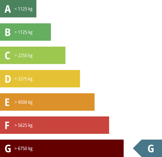
In order to make CO₂ emissions easy to compare, a classification of ascending sustainability classes (label G to A) is used.
- A: less than 1125 kg
- B: 1125-2250 kg
- C: 2250-3375 kg
- D: 3375-4500 kg
- E: 4500-5625 kg
- F: 5625-6750 kg
- G: more than 6750 kg
Costs of CO₂ emissions
| Based on residual CO₂ emissions |
|---|
This indicator shows the costs for the residual carbon footprint after measures. There are several ways to look at emissions-related costs:
- Some organisations opt for compensation programs that invest in projects that reduce CO₂ emissions elsewhere, for example by planting trees. The costs shown are based on the Gold Standard of, among others, WWF.
- Other organisations choose to express CO₂ costs based on European emissions trading. The costs shown here are based on the EU Carbon Price Tracker (see for example https://ember-climate.org/data/data-tools/carbon-price-viewer Opent in nieuw tabblad ).
- Organisations that choose to capture and store their CO₂ emissions will find an estimate of the associated costs here. These costs strongly depend on the chosen provider and solution.
The values used in the calculation can be changed in the settings screen.
Energy consumption
This indicator shows the annual potential energy savings as a result of the set measures. The key figures used are based on the STREAM study by CE-Delft (see https://ce.nl/publicaties/stream-personenvervoer-2022 Opent in nieuw tabblad).
Reports
Breakdown current CO₂ emissions
| Mode of transport | Distance driven | CO₂ kg/km | CO₂ emissions |
|---|
This indicator shows a breakdown of the organisation's total annual CO₂ emissions from commuting in the current situation.
The annual distance travelled is shown for each mode of transport, along with the average emissions per kilometre and the total annual emissions.
Breakdown potential CO₂ emissions
| Mode of transport | Distance driven | CO₂ kg/km | CO₂ emissions |
|---|
This indicator shows a breakdown of the organisation's total annual CO₂ emissions from commuting, based on set measures.
The annual distance travelled is shown for each mode of transport, along with the average emissions per kilometre and the total annual emissions.
Statutory CO₂ reporting
This indicator shows CO₂ reports available to your organisation. They show CO₂ information from your mobility scan in the specific form and scope that matches the report in question. Reports are based on the current situation, without taking into account any set measures.
Click on the report of your choice to open it.
Costs
Variable commuting costs
This indicator shows the annual variable commuting costs, based on the stated mileage allowances per mode of transport. It shows the level of costs before and after measures. Fixed costs, such as leasing contracts, are not included. MobilityAnalyst only supports fixed costs per kilometre and does not (yet) support scales or limit values.
Variable commuting costs per FTE
This indicator shows the annual variable commuting costs per FTE, based on the stated mileage allowances per mode of transport. It shows the level of costs before and after measures. Fixed costs, such as leasing contracts, are not included. MobilityAnalyst only supports fixed costs per kilometre and does not (yet) support scales or limit values.
Annual variable commuting costs per mode of transport
This indicator shows the annual variable commuting costs per mode of transport, based on the mileage allowances per mode of transport. It shows the level of costs before and after measures. Fixed costs, such as for lease contracts, are not included. MobilityAnalyst only supports fixed costs per kilometre and does not (yet) support scales or limit values.
Cost savings parking spaces
The average cost of a parking space for the organisation varies greatly and depends on the location (inner-city or suburbian) and nature (garage or grounds). It is estimated that the average cost is € 700 per year.
Whether these savings can actually be achieved and in what time frame depends on several factors: is parking private or shared, and can parking places be easily divested?
Cost savings sick leave
The savings from reducing absence days vary considerably and depend on factors such as salary levels, the nature of the work, the need and ability to immediately replace absence, and the likelihood of lost turnover. On average, costs are estimated at €300 per absence day. If you want to use a different value, please adjust the value shown.
Cost savings workplaces
Office cost savings from increased home working vary considerably and depend on several factors. For instance, savings will be greater with structurally lower weekly occupancy, than when home working mainly happens on one specific day (e.g. Friday). Savings can include cost items such as buildings, infrastructure, staff and organisation, IT and administration.
You can decide which cost per workplace you want to calculate with. The default value given is based on the Occupier Cost Index from property consultant Colliers Opent in nieuw tabblad. This compared the office costs of 3,900 buildings in 28 countries according to the European facilities standard EN 15221-4.
Parking
Required parking spaces
This indicator shows the number of parking spaces required on an average day. This does not take into account a disproportionate week schedule or parking spaces for visitors or, for example, shared cars.
Required bicycle parking spaces
This indicator shows the number of bicycle parking spaces required on an average day (including shared bicycles). This does not take into account a disproportionate week schedule or bicycle parking spaces for visitors.
Required number of charging points
Although each situation is different and the number of charging stations depends, for example, on the number of electric company cars and the number of people and visitors you want to facilitate, there are some rules of thumb.
The indicator shown is based on the advice to offer one charging point per 10 parking spaces (note: Many charging stations contain 2 or more charging points). This standard corresponds to the EU decision as part of the package Clean Energy for All EuropeansOpent in nieuw tabblad.
According to this measure at all new or converted commercial premises 1 charging point per 10 parking spaces should be installed.
Workplaces
Average location occupancy

This indicator shows the number of people present at the work location on an average day. This does not take into account a non-proportional week level.
Average attendance

This indicator shows the number of days per week a person is present at the work location on average.
Coworking alternatives
| Operator | Number of people |
|---|
This indicator shows the number of people who can work remote according to set measures, and live near a coworking office of one of the major national providers. For each provider, the table shows the number of people living within a 5 km radius of one of their coworking locations.
Time
Total commuting time
This indicator shows the total annual commuting time of all people before and after measures. The commuting time calculations include the total times from door to door, which means:
- Car journey times consist of the average driving time of the outward journey and return journey plus the time required to park the car.
- Public transport travel times consist of travel time according to current timetables, including transfer times and the time required to go from home to the public transport stop and from the public transport stop to the destination.
- Cycling travel times include the cycling time over the fastest door-to-door bike route plus the time needed to park the bike.
Average commuting time
This indicator shows the average one-way travel time per FTE, before and after measures. The travel time is based on the mode of transport in accordance with the selected measures, taking into account any (extra) work-from-home days and weighted by the FTE factor so that a person who is present at the office for more days weighs more heavily in the average than a person with less presence.
Total times are calculated door-to-door, meaning:
- Car journey times consist of the average driving time of the outward journey and return journey plus the time required to park the car.
- Public transport travel times consist of travel time according to current timetables, including transfer times and the time required to go from home to the public transport stop and from the public transport stop to the destination.
- Cycling travel times include the cycling time over the fastest door-to-door bike route plus the time needed to park the bike.
Median travel time
% of people
has a travel time of less than
-
-
of people
has a travel time of less than
minutes
This indicator describes the travel time distribution in the potential situation.
Top line: enter a percentage to see the maximum travel time for that group of people. Leave it at 50% to show the median.
Bottom line: enter a travel time to see what percentage of people travels within that time.
Change in travel time
This overview visualizes the individual changes per one-way journey and shows how many people have their commuting time affected in what way, either for better or for worse, as a result of the specified measures.
Move the mouse over the graph for details.
Overview of individual one-way travel times
This graph shows the number of people divided per 15 minutes of one-way journey time, i.e. the number of people who, for example, have a travel time between 0 and 15 minutes before (grey) and after (blue) measures.
Distance
Total distance
This indicator shows the total annual distance travelled for commuting, taking into account the travel distances associated with the relevant travel method (i.e. cyclists calculated on cycling routes, etc.), before and after measures. This indicator is strongly influenced by homeworking measures.
Average one-way distance
This indicator shows the average one-way journey distance per mode of transport, based on set measures. This is an unweighted average across all people, without taking into account the number of travel days per person.
Median travel distance
% of people
has a travel distance of less than
-
-
of people
has a travel distance of less than
kilometre
This indicator describes the travel distance distribution in the potential situation.
Top line: enter a percentage to see the maximum travel distance for that group of people. Leave it at 50% to show the median.
Bottom line: enter a distance to see what percentage of people lives within that distance.
Vitality
Impact on sick leave due to active travel
Several studies have shown that people who cycle to work call in sick less often on average. The average number of sick-leave days for cyclists is 7.4 compared to 8.7 for non-cyclists. Among cyclists, there is a larger group who never call in sick. The frequency of absenteeism among cyclists is also lower than that of non-cyclists.
More information?
- Preventive Medicine: The association between commuter cycling and sickness absence Opent in nieuw tabblad (English)
- Institue for employment-studies: Impact of the Cycle to Work Scheme Opent in nieuw tabblad (English)
- TNO: Fietsen is groen, gezond en voordelig Opent in nieuw tabblad (Dutch)
- Nationaler Radverkehrsplan: Forschung Radverkehr Opent in nieuw tabblad (German)
Total calories used
This indicator shows the annual calories burned as a result of walking and cycling, including when that is part of a public transport journey.
This indicator shows the Big Mac equivalent of this. According to McDonald's statement, a Big Mac contains 524 kcal, or 2,191 kJ.
Source: 2024 Compendium of Physical Activities Opens in new tab
Calories burned per mode of transport
This indicator shows calories burned per mode of transport as a result of walking and cycling.
Percentage of people who meet the physical activity guidelines
This indicator shows the proportion of people who achieve the physical activity guidelines just by commuting (by walking or cycling). These guidelinges have been defined by the World Health Organisation (WHO) and have been translated to local, national guidelines. For adults, the main recommendations are:
- Physical activity has significant health benefits for hearts, bodies and minds.
- Do at least 150 minutes of moderate-intensity aerobic physical activity per week, like walking and cycling, spread out during the week. Longer activity, more often and at higher intensity, provides additional health benefits.
- Do muscle- and bone-strengthening activities at least twice a week.
- Limit the amount of time spent being sedentary.
The percentage shown is the share of people walking or cycling more than 150 minutes per week for their commute.
Active travel
Composition of active travel
This is a representation of the indicative subdivision of the different forms of active travel in the new situation, based on the following assumptions: For distances up to 1.5 km, we assume walking. For distances up to 1.5 km we assume walking. For distances from 1.5 km to 5 km, we assume a regular (city) bicycle, for distances from 5 to 15 km an e-bike and above that a speed pedelec.
The percentages shown are relative to the total number of people who travel with active travel, accordance to set measures.
Move the mouse over the graph for details.
Time spent on active travel
This indicator shows the annual time spent on active travel. This only includes commutes walked or cycled from door to door.
Overlapping travel options
Public transport
Composition of public transport chains
This indicator shows the composition of the used public transport chains by types of public transport, taking into account any set measures.
You can choose between displaying the distribution in kilometres or travel time.
This indicator shows the composition of the used public transport chains by type of first and last mile transport, taking into account any set measures.
Note: Detailed information on public transport chains is only available in files of individual employers.
Public transport quality
In addition to commuting time, the number of transfers is an important indicator of the quality of a public transport connection. This indicator shows the average number of transfers in the fastest public transport connection for all people who travel by public transport, according to the set measures.
This includes all transfers between public transport connections (i.e. train-train or train-bus), and not car-train or, for example, train-bicycle.
Note: If people already travel by public transport, they will continue to do so, regardless of the set maximum number of transfers. Multiple transfers are already acceptable for those travelers at the moment and it would be illogical that they no longer travel by public transport as a result of the measure. As a result, the average number of transfers may exceed the set maximum number of transfers.
Public transport journeys during rush hour
This indicator shows the weekly number of public transport commutes during peak hours, before and after measures.
Disembarkation stations
| Last station | Number of people |
|---|
This indicator shows the number of public transport commuters who use the train and shows a list of used disembarkation stations, in accordance with (possible) measures. These are the last used train stations in the public transport chain.
P+R potential
| Location | Number of people |
|---|
This indicator shows the number of public transport commuters using the combination public transport and car (P+R) and shows a list of used P+R facilities in accordance with the set measures.
Car / motorcycle
Fuel mix car/motorcycle
This indicator shows, if known, the distribution by fuel types of cars and motorcycles used, taking into account any set measures.
The dropdown menu can be used to switch between displaying vehicle numbers or kilometre numbers, and for displaying any company cars.
Fleet
This indicator shows the number of company cars, according to the data provided and the potential. This is influenced by the car measure 'discontinue company cars'. Without this measure, MobilityAnalyst will not change company cars.
Car reduction potential
This indicator shows the number of car journeys (one way) on an average working day that can be saved by the set measures.
Car journeys to the station are considered part of a public transport journey and are not counted as a car journey.
Car journeys during rush hour
This indicator shows the weekly number of car commutes during peak hours, before and after measures.
Commuting time loss due to congestion per driver
This indicator shows the number of hours that an average driver loses per year as a result of traffic congestion, calculated by comparing the individual peak commuting times with off-peak commuting times.
Ride share potential
Persons who do not travel by bicycle or public transport may be able to travel together, for example by carpooling or using company vans. If these motorists travel together, it can save costs, CO₂ emissions and travel time.
If necessary, use the 'Ride sharing' settings
Regional
Regional map
MobilityAnalyst provides various regional analysis capabilities for many regions. These capabilities provide insight into trips from certain areas of origin, past certain analysis points or to certain destination areas. These areas and points are predefined, often in consultation with a regional partner.
The analysis points help to gain insight into road use at certain bottlenecks in the road network or crowds on public transport routes. The number of commutes per section is shown before and after measures, in order to investigate the effectiveness of, for example, measures to avoid rush-hour and road works.
The origin and destination areas help, for example, to gain insight into where groups of employees of an organisation or region come from.
Note: if you want to zoom in on the characteristics of persons passing such an analysis point, it is possible to make a selection of those persons via 'advanced filtering' in the data screen.
Analysis points
| Name | ID | Type | Additional delay |
Hits per week | Persons | ||||
|---|---|---|---|---|---|---|---|---|---|
| Current | Potential | Difference | Current | Potential | Difference | ||||
This overview shows the analysis points that are (potentially) passed by people within the scope of this mobility scan. These predefined points help to gain insight into road usage around certain bottlenecks in the road network or, for example, congestion on public transport.
For each analysis point, in addition to name, ID and type, the number of weekly passages before and after the configured measures on this trajectory is shown ('hits per week') and how many people this concerns. This allows, for example, the potential of peak hour and hindrance avoidance measures to be examined.
The table shows the sum of any morning and evening traffic on this specific road segment.
For each analysis point, it is possible to specify an additional delay. This specialised function can help simulate the effects of major planned roadworks. Additional delays set in this way are added on top of the known delays at the time of compiling this scan and are reflected throughout the rest of the dashboard. Additional delays on car routes can, for example, improve the relative attractiveness of public transport and thereby lead to more public transport users. It does not lead to entirely new route calculations and different driving routes.
Note: if you want to zoom in on the characteristics of persons passing such an analysis point, it is possible to make a selection of those persons via 'advanced filtering' in the data screen.